Client
Yarra Ranges Osteopathy
Services
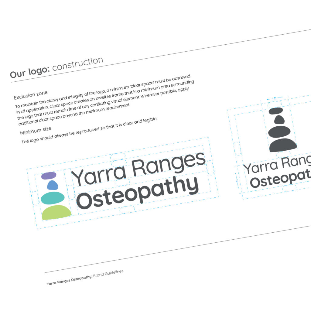
Logo design
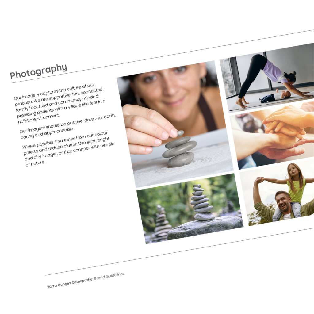
style guidelines
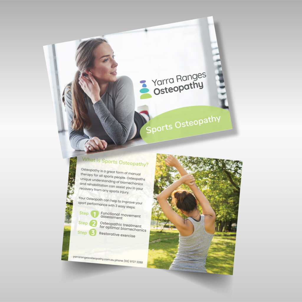
stationery
signage
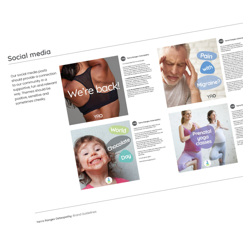
social media elements
Year
2021
Yarra Ranges Osteopathy offer a holistic and cohesive approach to wellness. Patients attend their practice to be supported in multiple strategies to help them achieve positive outcomes. They believe that a healthy, pain free body supports a stronger emotional and mental wellbeing and work with patients to help reach this goal.
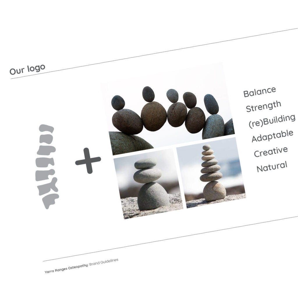
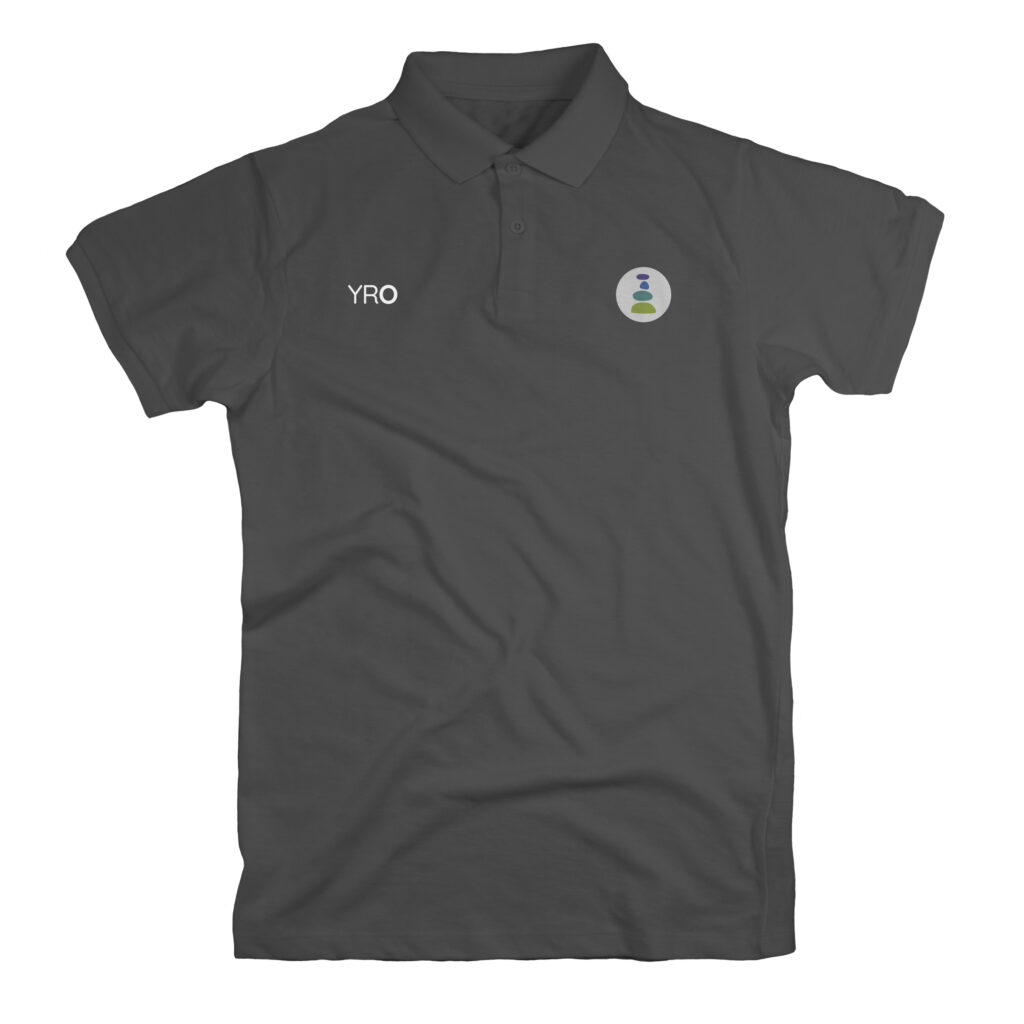
Their logo – a rock stack resembling a vertebrae – symbolises balance, personalised care and is also suggestive of stepping stones, reflecting their process of achieving wellness.
Irregular and unique shapes reflect the diversity of patients and the customised process of care they require.
Vivid pastel colours injects vitality, optimism, and positive energy into the healing environment, while the complementary saturation balances this energy with a soothing sense of calmness and clarity.